Public coverage of Hex using GPT-6 Astra for complex analysis and visual reports is a useful signal for event teams.
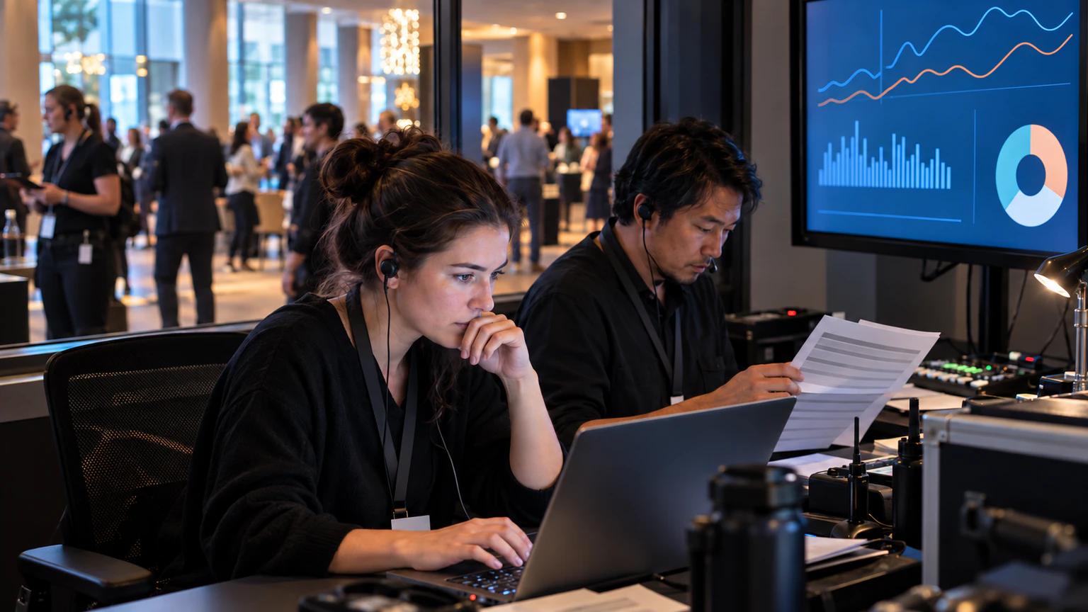
It suggests a more direct path from raw data to readable dashboards and AI-assisted reporting. For event operations, analytics teams, and product managers, that is worth paying attention to.
But it is best treated as a market signal, not a complete operating blueprint.
A live dashboard is only as useful as the event questions it helps a team answer in time to act.
Why this matters
Most event teams do not struggle because they have no data. They struggle because the data is spread across tools, arrives at different speeds, and is difficult to turn into a shared operational view during a live event.
That can affect decisions around:
- attendance pacing
- session performance
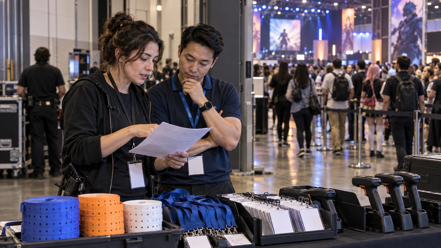
- check-in pressure
- staffing needs
- sponsor visibility
- post-event reporting
If AI can help turn complex analysis into visual reports faster, the practical appeal is obvious. Teams may be able to spend less time assembling dashboards manually and more time responding to what the event is actually doing.
What the public signal suggests
Based on the public description, the key idea is not just AI text generation. It is AI-assisted data storytelling through analysis and visualization.
That matters because event teams rarely need data outputs in isolation. They need a usable view of what is happening, what changed, and what deserves attention next.
In an event setting, that could be valuable when teams are trying to interpret patterns quickly across attendance, engagement, schedules, or internal operations reporting.
Still, public announcements usually highlight the promise, not the day-to-day constraints.
For live events, speed is helpful, but trust is mandatory.
Start with the operating question, not the AI layer
The fastest way to misuse an AI dashboard workflow is to begin with the technology before agreeing on the decision it should support.
Event teams should begin with a smaller set of practical questions:
- what live decision would this dashboard improve
- who needs to see it
- how often does it need to refresh
- which source systems feed it
- what action should follow if the numbers change
If those answers are vague, adding AI-generated reporting may only make the presentation look better without improving event operations.
Where live-event dashboards are most likely to help
Not every dashboard use case needs the same level of urgency.
For event teams, the strongest candidates are usually the ones tied to active coordination during the event or immediate review after each day.
Promising operational use cases may include:
- tracking check-in progress against expected arrival windows
- comparing session attendance patterns across rooms or time slots
- summarizing engagement trends for internal stakeholders
- highlighting unusual drops, spikes, or gaps that need review
- turning multi-source event data into a clearer end-of-day report
These are useful because they connect analytics to action. They are not dashboards for display alone.
What event teams should test before rollout
Before relying on an AI-assisted dashboard workflow in a live-event environment, teams should test the operating basics first.
1. Data timing
Live reporting can fail even when the chart looks polished. If one source updates every few minutes and another updates much later, the dashboard may create false confidence.
Review whether the timing of each source matches the decisions the dashboard is meant to support.
2. Data definitions
Simple labels often hide messy logic.
For example, a team may say attendance when they actually mean registrations, check-ins, room scans, unique visitors, or session joins. If the AI layer summarizes inconsistent definitions, the output may be readable but operationally misleading.
3. Review responsibility
Someone still needs to own the interpretation.
Even if AI helps produce a visual report, event teams should decide who reviews the output before it informs staffing, sponsor updates, or public-facing summaries.
4. Exception handling
Test what happens when the data is incomplete, delayed, duplicated, or unusually noisy. Event operations are full of edge conditions, especially during arrival peaks and schedule changes.
5. Audience fit
One dashboard rarely serves everyone equally well. A floor manager, an operations lead, and a stakeholder reviewing outcomes may each need a different level of detail.
That matters because overloaded dashboards often create more discussion than action.
Keep the human review loop
AI-generated analysis can save time, but event teams should stay careful about treating narrative summaries as final truth.
In practice, the safest pattern is usually:
- collect the right source data
- generate a first-pass visual and summary layer
- review anomalies against the underlying event context
- share only the version that supports a real decision
This is especially important during live operations, where one misleading summary can cause unnecessary escalation or distract the team from the real issue.
A practical evaluation checklist for event teams
If your team is assessing AI-assisted dashboards inspired by this kind of public development, use a practical review frame:
- identify one reporting workflow that currently takes too long
- define the event decisions that depend on that workflow
- list the source systems and data owners involved
- check whether the key metrics have stable definitions
- test whether the output is understandable to non-analysts
- decide who approves the dashboard view during live operations
- separate experimental reporting from trusted operational reporting at first
This keeps the project grounded. It also reduces the risk of adopting an impressive-looking dashboard flow that does not hold up under event pressure.
Stay realistic about what public announcements can tell you
Public coverage can reveal where the market is moving. It usually does not reveal enough to copy the setup directly.
That is true here as well. The signal is useful: AI visualization and analysis workflows are becoming more relevant for teams that need faster reporting. But each event organization still needs to validate the data quality, governance, and operational fit for its own environment.
The right question is not whether AI-generated dashboards are interesting. They are.
The better question is whether they can make your event team faster, clearer, and more reliable without weakening trust in the numbers.
What this means for event teams
For Bewitt readers, the practical takeaway is simple.
AI-driven dashboards are most valuable when they reduce interpretation delay around live event data, not when they simply add a more attractive reporting layer.
Teams should evaluate these tools through an operations lens: data timing, decision usefulness, review ownership, and clarity for the people who actually run the event.
If that foundation is in place, AI-assisted visual reporting could become a meaningful support layer for event analytics. If it is not, the dashboard may look smarter than the workflow behind it.