Trade show booths are often designed around what the exhibitor wants to display. Increasingly, the better question is what the buyer needs to do next.
That shift matters for exhibitors, but it also matters for organizers. When more booths are built around clear visitor journeys, the show floor becomes easier to navigate, easier to staff, and more useful for real business conversations.
Recent industry discussion around buyer-first trade show strategy points in the same direction: the booth is no longer just a branded footprint. It is part of a decision journey.
A strong booth does not start with the stand design. It starts with the buyer task.
Why this matters
Many event teams still see booth performance mainly through visible signals: size, build quality, traffic volume, and visual impact.
Those things matter, but they do not guarantee good outcomes.
A busy booth can still fail if visitors cannot quickly understand:
- who the booth is for
- what problem it helps solve
- where to start
- who to speak to
- what happens after the conversation
Buyer-centric design improves those moments. It makes the booth easier to use, not just easier to notice.
For organizers, that can also reduce common floor-level issues such as aisle congestion, uneven engagement, confused visitors, and frustrated exhibitors.
What buyer-centric booth design actually means
Buyer-centric design is not just softer messaging or more hospitality. It is a practical way of planning the booth around visitor intent.
That means asking questions such as:
- Why is someone stopping here?
- What stage of the buying process are they in?
- What information do they need first?
- Do they want a quick orientation, a demo, a technical answer, or a commercial discussion?
- Can they move through the booth without friction?
Different visitors need different journeys. A first-time prospect, an existing customer, a partner, and a media contact should not all be forced into the same interaction pattern.
In practical terms, buyer-centric booth planning usually leads to clearer zoning, clearer signage, better staffing positions, and more deliberate next steps.
Start with buyer journeys, not booth features
A common exhibitor mistake is to begin with the stand package, screen count, furniture order, and graphics wall. Those choices matter later, but they should not come first.
Start with the journeys you want to support.
For example, many booths need to serve at least three paths:
1. The fast passerby
This person gives you a few seconds. They need immediate clarity.
They should be able to tell, almost at a glance:
- what the company does
- which audience it serves
- why it is relevant
- whether it is worth stopping
If the message is too broad, too technical, or buried in visual clutter, they keep walking.
2. The curious evaluator
This person is open to learning more but does not want a hard sell. They may want a simple explanation, a use case, or a short demo.
This journey works best when the booth offers:
- a natural welcome point
- a clear path to a conversation
- easy-to-read proof points
- a visible staff member who can guide without blocking
3. The ready buyer
This person wants substance. They may need pricing context, product detail, implementation answers, or a scheduled follow-up.
If the booth has no quieter discussion space, no clear ownership for serious leads, or no way to move into a deeper conversation, strong opportunities can be lost in the noise.
The goal is not to trap every visitor in the same experience. It is to match the interaction to the visitor's intent.
How this changes booth layout decisions
Once buyer journeys are clear, booth design becomes easier to evaluate.
The key question is simple: does the physical setup help visitors move forward?
That often changes decisions in a few areas.
Entry points
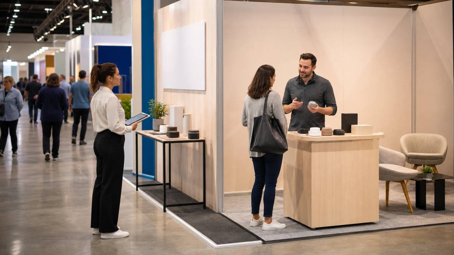
If the front edge of the booth is blocked by furniture, product plinths, or staff standing in a line, visitors may hesitate to enter.
A buyer-centric booth usually feels open and readable from the aisle.
Messaging hierarchy
Most visitors will not read everything. Prioritize one core message, then a small number of supporting cues.
Think in layers:
- first glance: who it is for
- second glance: what it helps with
- third step: where to engage
Activity zones
Not every conversation should happen in the same spot. Consider separating:
- quick welcome interactions
- short demos
- deeper product discussions
- private or semi-private buyer meetings
This helps staff handle different visitor types without creating bottlenecks.
Proof and credibility
Buyer-centric does not mean removing detail. It means placing detail where the right person can find it at the right moment.
Case studies, product comparisons, technical validation, and industry examples should support the conversation, not overwhelm the entrance.
What exhibitors should review before the event
If an exhibitor wants to shift toward buyer-centric booth design, a pre-show review should cover more than graphics and logistics.
A useful planning checklist includes:
- the main buyer personas expected at the event
- the top questions those buyers usually ask
- which booth zones support which interactions
- how staff will qualify and hand off visitors
- what follow-up action should happen after each conversation type
- whether the booth message is understandable in under ten seconds
This is also a staffing exercise, not just a design exercise.
If the team does not know who handles early-stage curiosity versus late-stage buying questions, the booth journey breaks down quickly.
What organizers can do to encourage better booth journeys
Organizers cannot design every exhibitor booth, but they can shape the conditions around them.
That starts with exhibitor guidance. Instead of focusing only on technical manuals and deadline reminders, include advice that helps exhibitors think about buyer flow and visitor usability.
For example, organizer support packs can encourage exhibitors to consider:
- open sightlines from the aisle
- clear front-of-booth messaging
- staff positioning during peak traffic
- accessible meeting space
- demo noise control
- queue management for activations
Floor planning also matters. If the event layout creates heavy congestion, poor visibility, or awkward traffic patterns, even a well-designed booth may struggle.
Buyer-centric outcomes are easier when the show floor itself supports easy movement and clear discovery.
Common mistakes to avoid
Several patterns regularly weaken booth performance.
- Designing for brand theatre only: visual impact matters, but not if buyers cannot quickly understand the offer.
- Overloading the booth with messages: too much information creates hesitation.
- Treating every visitor the same: different buyer stages require different conversations.
- Letting staff cluster at the entrance: this can make the booth feel closed rather than welcoming.
- Ignoring next-step planning: if there is no clear follow-up path, interest stays on the floor.
- Building noisy demos into every interaction: high energy is not always the same as high quality.
A practical buyer-centric booth review
Before show open, exhibitors and organizer teams can walk through a simple review.
- Stand in the aisle and check whether the booth purpose is obvious.
- Confirm that a new visitor can tell where to start.
- Test whether staff can greet without blocking entry.
- Check that demos, conversations, and meetings do not interfere with each other.
- Review whether the booth supports both quick stops and serious discussions.
- Make sure the next step after a good conversation is clear and easy to capture.
That kind of review is simple, but it often catches the most expensive mistakes before the first attendees arrive.
What this means for event teams
Buyer-first thinking is not only a marketing trend. It is a useful operational lens.
It helps exhibitors build booths that work harder. It helps organizers create floors that feel more navigable and commercially effective. It also creates a better experience for attendees, because the environment becomes easier to understand and easier to use.
Not every stand needs a major redesign. In many cases, the biggest gains come from a clearer welcome point, better staff flow, stronger message hierarchy, and more deliberate conversation paths.
That is what makes this shift practical. It is not about making every booth more complex. It is about making every buyer interaction more intentional.
Final thought: the best booth journeys feel simple to the visitor because the hard thinking happened before the doors opened.